Experience



The whole cycle got faster and clearer, and more of it was right the first time. Design, product, and engineering got time back, and fewer missed states turned into rework.
Context
Reviews kept missing the messy screens.
Reviews jumped between screenshots, tickets, and the path where everything goes right. Empty screens, error messages, and layouts that broke on a phone slipped through until QA found them.
Those states were already in the prototype. Getting to one meant remembering the clicks that lead there, and a review rarely covered every path.
I built a tool that reads the prototype and puts those screens and states on the left. You move through them, and picking one takes you straight there.
Once you’re on a state, you can compare it to what’s in production and check it on different screen sizes. When the prototype changes, the navigation updates with it.
The cycle got faster for design, product, and engineering. More of the work was right the first time, and fewer states slipped through to QA.
Less time, a faster cycle. Design, product, and engineering spent less time finding a state and walking back through the paths that get you there.
Missed states caught in review. Empty screens, failures, and broken layouts showed up in review, before they reached production.
Right the first time, less rework. More of the work was right the first time, so less of it came back after it left design.
Rework during development dropped by about 90%. Years of quick fixes, replaced one piece at a time.
Context
The app had become a pile of quick fixes.
Palmtech is used by more than 40,000 home inspectors, and they don’t all work the same way. For years the team answered the loudest feedback by adding a button or a screen. That calmed the person who asked. It also made the next part of the job harder. The look of the app scattered, and it got hard to use and harder to build on.
I was brought in to undo that carefully. Clean up the screens a bit at a time, pull groups of features out, and replace them in an order we chose. Each change had to stay small enough that an inspector’s day still worked.
Outputs & Outcomes
Rebuild it underneath them, without making them start over.
I stopped reacting to one request at a time. We lined up the rebuilds: comments first, then navigation, then photos and video, then the rating lines. No release asks someone to relearn the whole app. Adding AI waited until those four were done, and it stayed small.
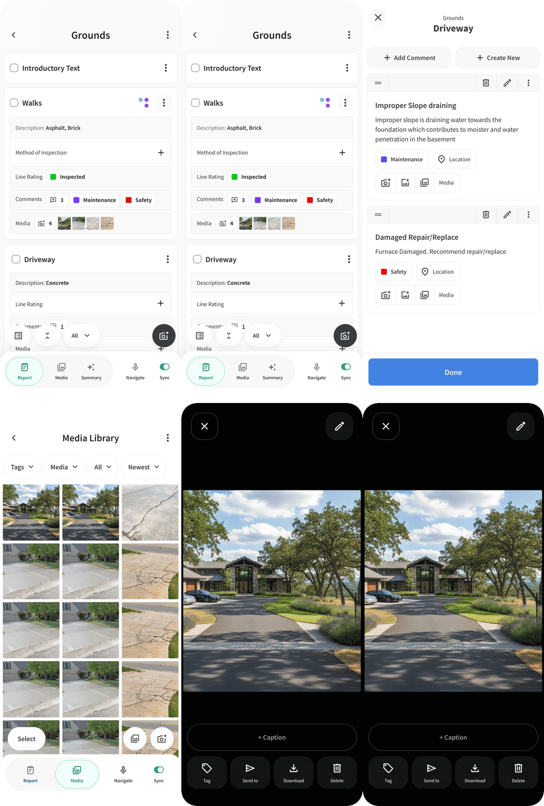
As each piece landed, I added settings so an inspector can choose how things work and look, instead of one default for everyone. I also built a working React prototype the whole team could open. You can step through each phase of the rollout, and look at an empty inspection or one filled with sample data. Product, engineering, and design looked at the same build, changed it together, and tested it with real inspectors before the React Native app caught up.
The main flows, queued in order. Comments went first, because that’s where inspectors disagreed the most. Then navigation, media, and ratings. Each release moves one group of features onto the new screens, and the rest of the day stays put.
Settings layered on the new screens. Settings go on top of the rebuilt screens as we ship them, so one inspector’s way of working doesn’t become the screen for everyone.
One prototype, many phases. The same React build can show each step of the rollout, empty or already filled in. That’s what product, engineering, and design use to build, review, and test in the field.
Filling out an order in the field got 5× faster. The whole order stays in view while you fill in the details.
Context
Inspectors couldn’t see what was still missing.
Inspectors fill out big orders on a phone, out at the house. The old app pushed them down a stack of screens. Once they were inside a detail, they couldn’t see the rest of the order, so they left jobs with gaps they didn’t know were there.
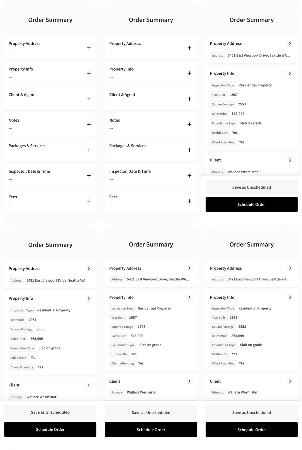
I kept the summary of the order on screen the whole time. The details open on top of it. When you finish a section, that summary shows what you entered. You never lose the order just to edit one line.
Outputs & Outcomes
See the whole order, and open a detail only when you need it.
If something is missing, the summary says so. Once a section is done, what you entered shows up on that line. Inspectors edit in a panel and come back to the same order, still in view.
Filling out an order in the field got 5× faster. It shipped in ISN’s field app, and thousands of inspectors use it. Later flows reused the same approach.
5× faster to finish an order. Inspectors finished entering an order in a fraction of the time the old stack of screens took.
Shipped in ISN’s field app. The new flow moved from a prototype into the app inspectors use on the job.
Thousands of inspectors using it. The time saved adds up on every order created in the field.
Teams kept their speed while the calendar got simpler. A simpler calendar that experienced schedulers still recognized.
Context
Make it simpler without slowing the day down.
Scheduling is how an inspection company runs its day. The people who live in this calendar are fast, and the business depends on that speed. Throwing it out and starting over would have made them learn it all over again.
I kept the way they already thought about the day. I made it clearer what to look at first, and I moved the settings to the moment you actually need them. The timeline and the agenda are two ways of looking at the same appointments.
Outputs & Outcomes
The same calendar, with clearer views and controls where you need them.
Experienced schedulers still recognized it. The controls sit on the appointment, not in a settings screen off to the side. Timeline and agenda share the same appointments, so we didn’t end up maintaining two calendars.
The simpler calendar didn’t slow anyone down, and support didn’t spike.
People stayed with it. The habits people had already learned stayed intact, so the update didn’t make them start over.
Faster to book. Putting the controls on the appointment shortened each booking, and fewer people abandoned one halfway through setup.
Less support, one calendar. Timeline and agenda share the same appointments, which cut duplicate work and tickets about the two views disagreeing.
Typical underwriting decisions went from 25 minutes to 10. One screen for the house, the applicant, and where the sources disagree.
Context
The hard part was finding the file, not making the call.
Underwriters were spending most of a decision just pulling the file together. Policy details, county records, photos, and notes lived in different places, and they often disagreed. This is the home-insurance line, somewhere between $26M and $148M a year. The limit was how long each file took, not how many policies were waiting.
I designed the screen they work in. The software pulls the evidence into one place and points out what doesn’t match. The underwriter still makes the call. We tried a simpler version that only showed a confidence score. It looked faster on paper, but sitting with underwriters made it obvious the version that showed its work was the one they trusted and actually used.
Outputs & Outcomes
Everything they need to decide, on one screen.
The location, the property, and the applicant all sit on one screen. The risks that matter, and the places the sources disagree, show up first. The backup material is one click away if they want to check it.
Decisions got faster because we took away the work of assembling the file. We didn’t hide the judgment. The underwriter still sees the evidence and makes the call.
Decisions in 10 minutes, down from 25. The same team moved more policies through review without adding people or skipping evidence.
The $26–148M business it serves. This screen replaced the tabs, spreadsheets, and other systems they used to piece a file together.
Fewer reversals, better decisions. When sources disagreed, underwriters could see it right there, so fewer decisions had to be corrected later.

Identity
Inspection Support Network

Identity
Palmtech

Identity
Guardian

Identity
Mary Mahoney Maison


Web Design
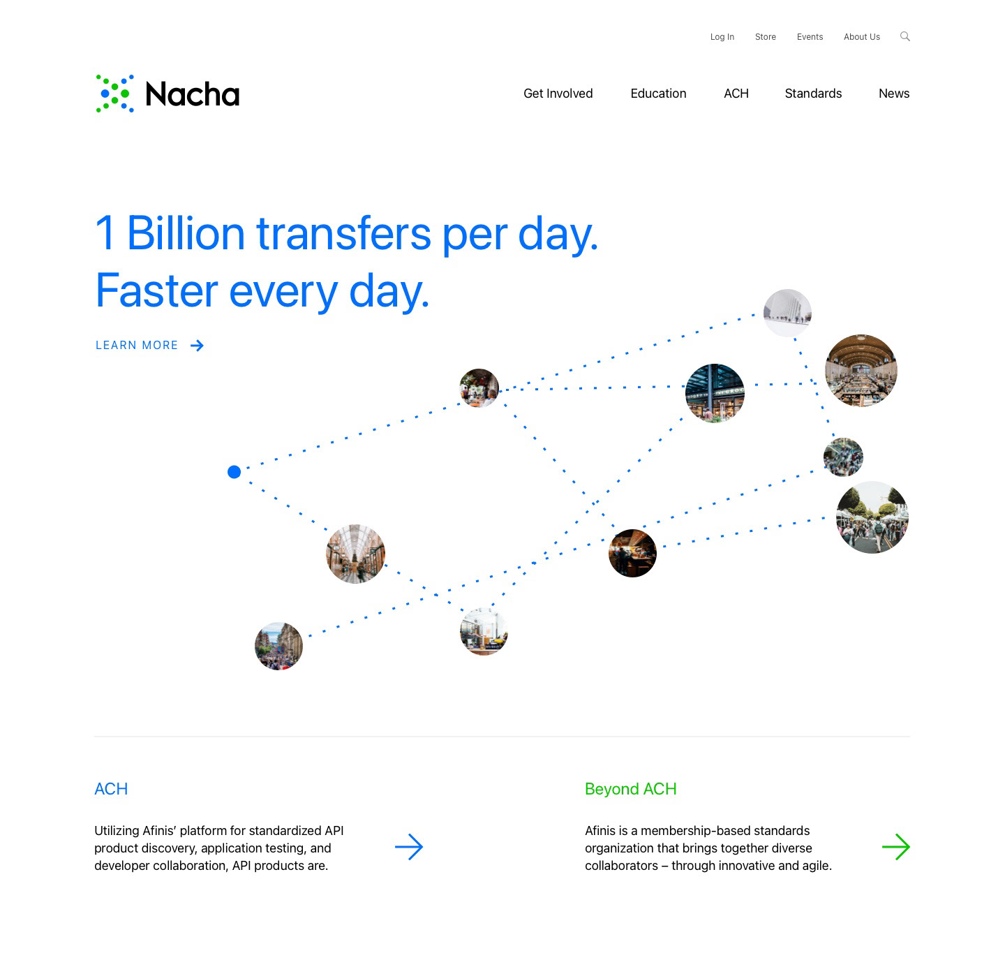
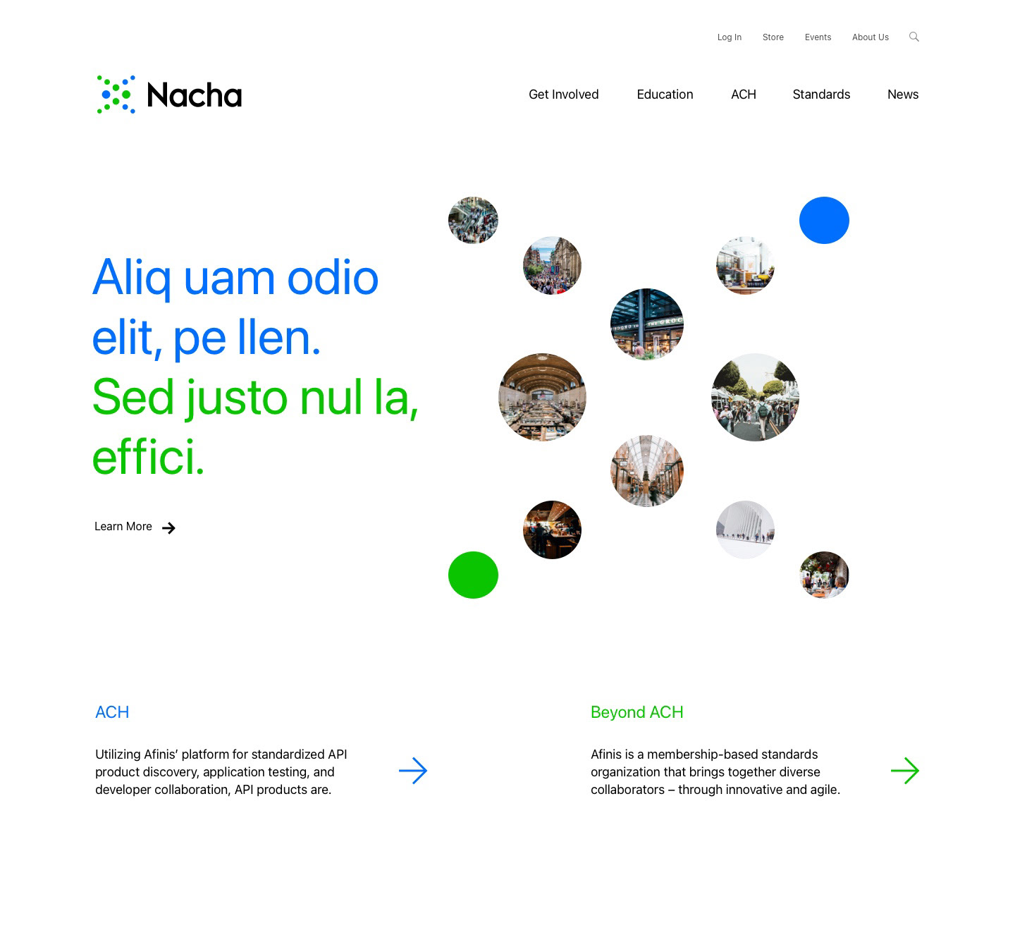
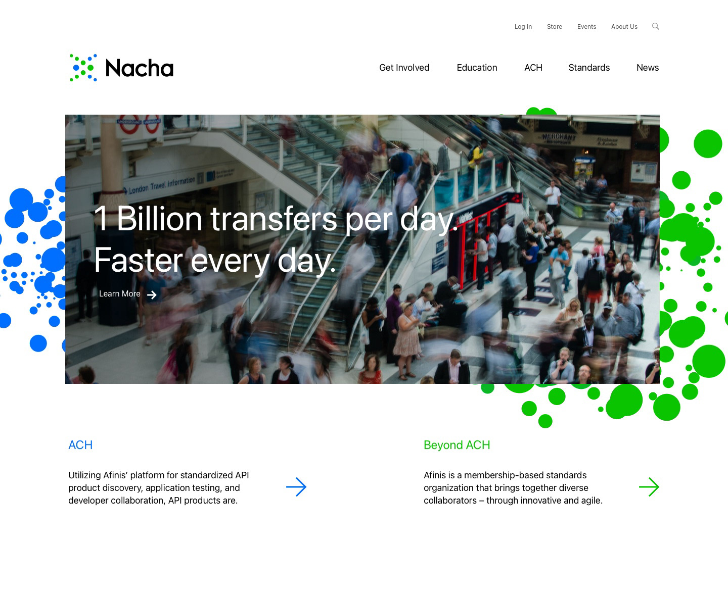
Nacha Web Design
Productivity
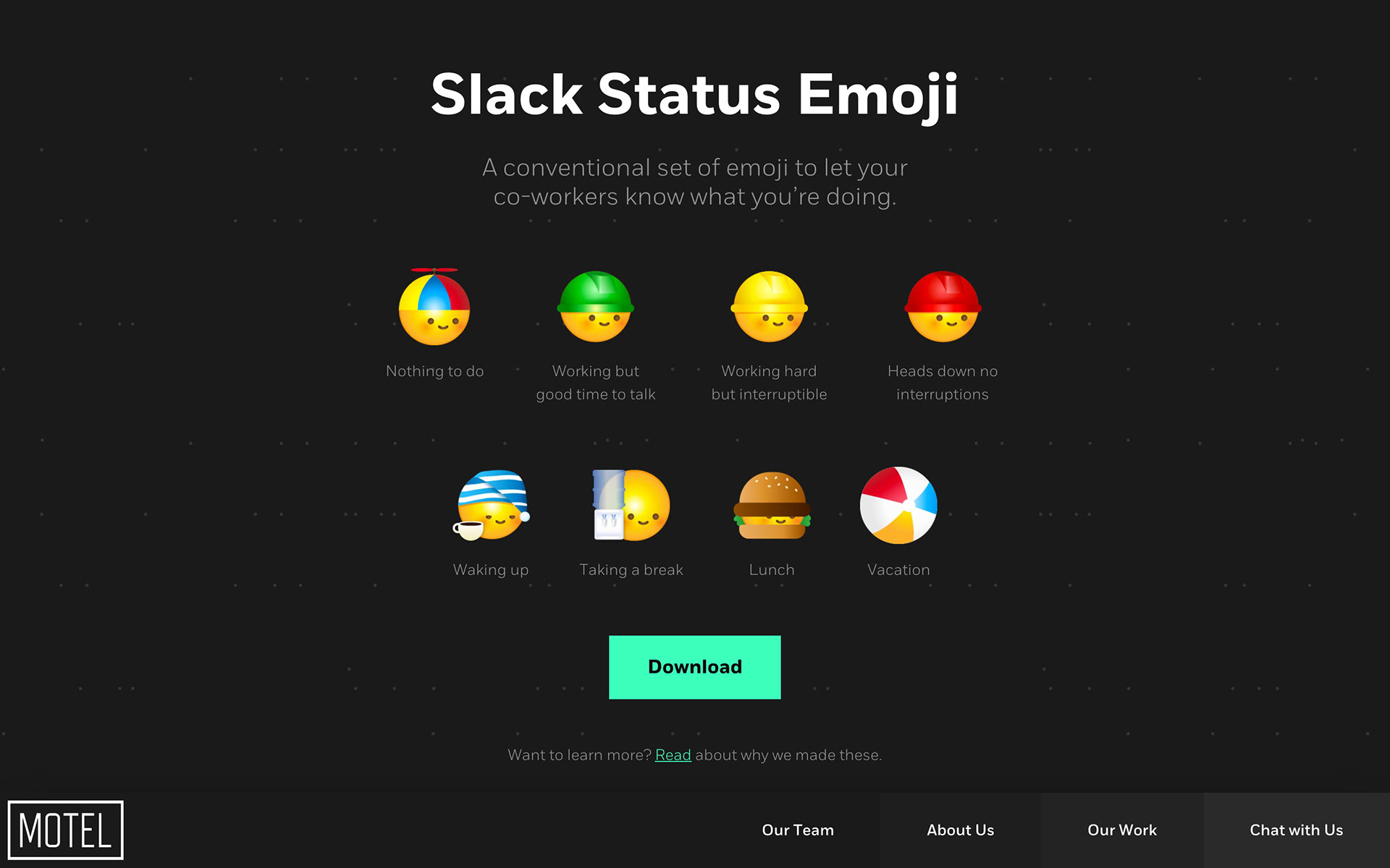
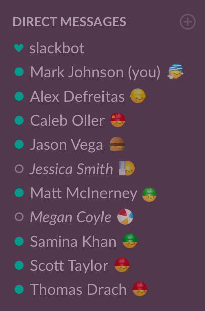
Slack Statuses
Just Art
Retreat Illustrations
Iconography
Invision Icon Sets